I own hundreds of premium themes. And some of them look great, the problem is the more flashy the themes become the less you can truly fine tune them for your needs. The truth of the matter is, the theme that is best for you is the one that works the way you need it to.
If I'm doing a product launch perhaps Elementor Pro, Beaver Builder , Brizy , OptimizePress or InstaTheme might work just fine. I have a few sites running Elementor Pro and overall they do the job well. I am the kind of person that likes to go in and edit my theme's code and a lot of these new themes make it nearly impossible.
This theme I am using here on IMSmartMoney is a custom built Elementor Pro theme, but it's nothing flashy, I chose it because it's clean and YOU the end user will not get bombarded with all kinds of images, popups, banners, etc.
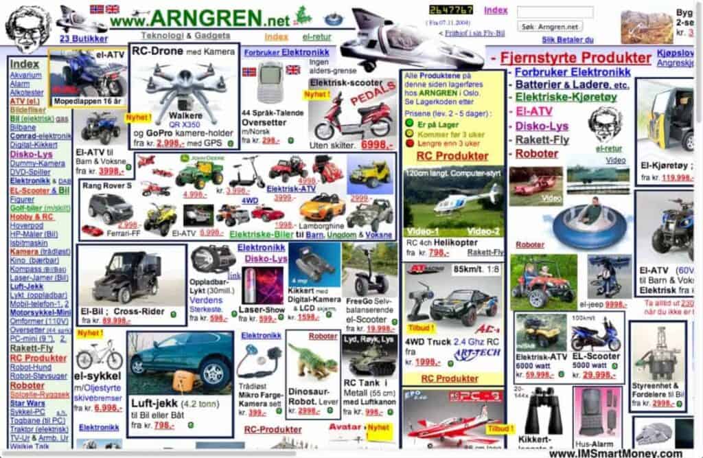
There is a mindset that ugly sites make more money…. this is true to a degree. If you arrive to a ugly site full of ads and junk content you are very likely to click anything that takes you off that site. So for making money off ads/Adsense this might be the want to go. But if you want to develop a community then this is the worst thing you can do. Take the image below of a real site, not sure if they are trying to confuse their visitors or win the world's ugliest website contest.
Click here for a larger view and to have your eyes burned out from ulgy
On the other hand if you arrive to a nice clean site with good valuable content then you are far more likely to return to that site. This is what builds a following and what you should be practicing if you want to foster a relationship with your visitors. Of course you can always build your sblog (spam blog) networks too 😉
When designing a WordPress site always approach it to how your visitors will navigate your site. Common page links such as logins should be available from every page, they shouldn't have to go thru a maze to get to a login page. Make your site user friendly, even if it's at the expense of full page backgrounds. Avoid clutter, sure put some ads in your free areas, but don't stick Adsense or other non-related ads in your members area. That's just plain insulting to your users.
Some themes are task specific, meaning they do thing well and that's it, for example AppThemes makes these kind of themes such as Classypress, JobRoller etc. they are meant for one function. You should never try to get a theme to do something it can't, no matter how pretty you think it is. So I decided to skip using OptimizePress for this site, because it's more than just some product launch page. I want YOU to find value in IMSmartMoney.com and come back for more. While nothing's perfect and I personally did the setup of the site and some custom coding hopefully it will be navigable for just about anyone.
So the old saying is true, keep it simple stupid and your visitors will love you for it.


